Customizing the workspace
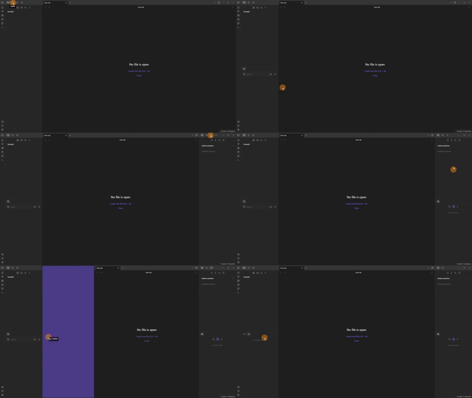
When first going into a new vault I move the panes around to places I prefer.
This does and can change overtime, so nothing set in stone.
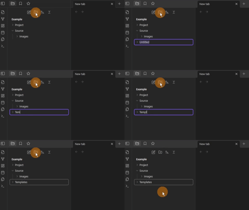
Creating an organizational structure
As Obsidian is all files and folders I make the same setup each time.
This means no matter what vault I am in, I know where things are stored.
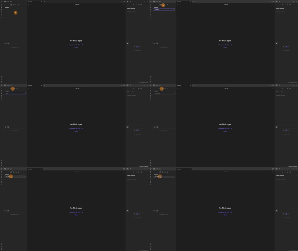
I have a “source” folder with the vault “image” folder inside.
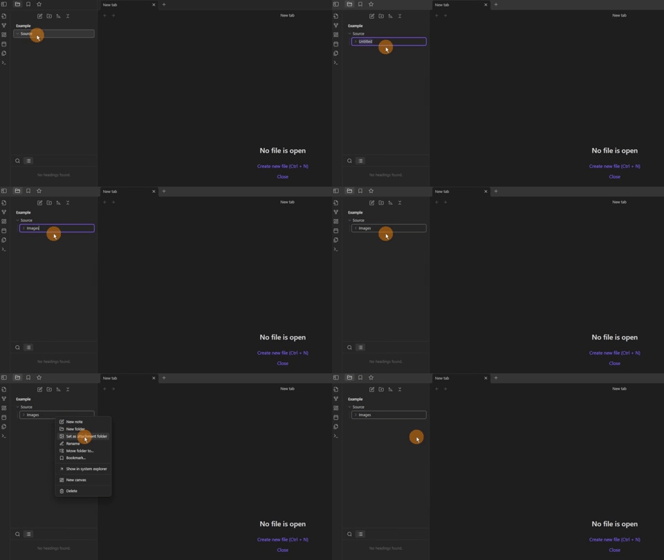
Then a “projects” folder for the main research projects.
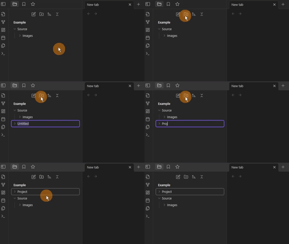
As each source or project will start of the same I use templates. So I need a template folder to store them all.
Altering the default settings
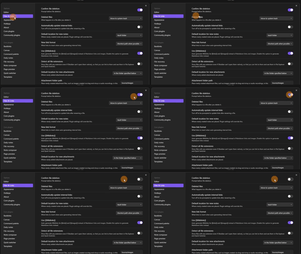
Files & Links settings
I change some settings for convenience, like turning off the file deletion message.
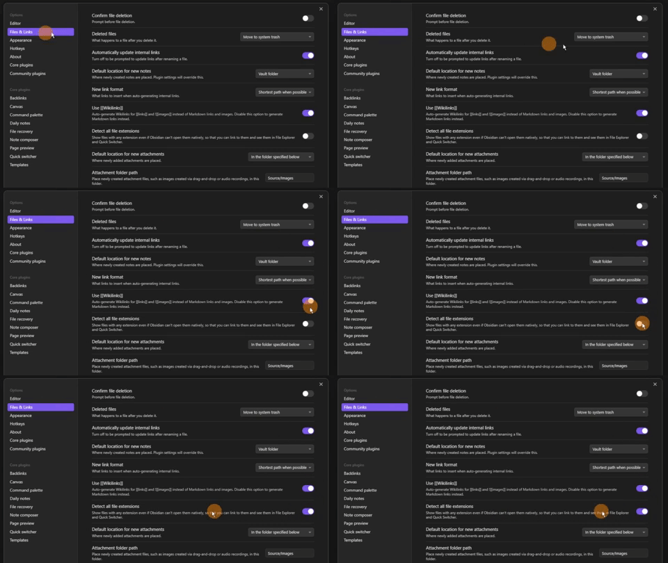
Automatic update for links.

Detect all file extensions.
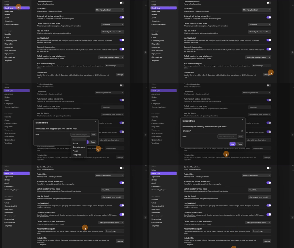
Excluding the templates folder reduces the template file priorities.
This helps mainly in the quick switcher.
Editor settings
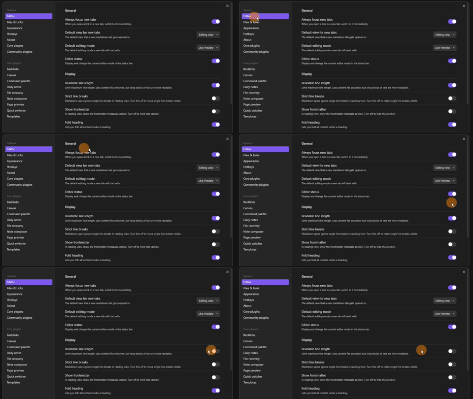
Turning readable line length off, gives me the full width of a file.
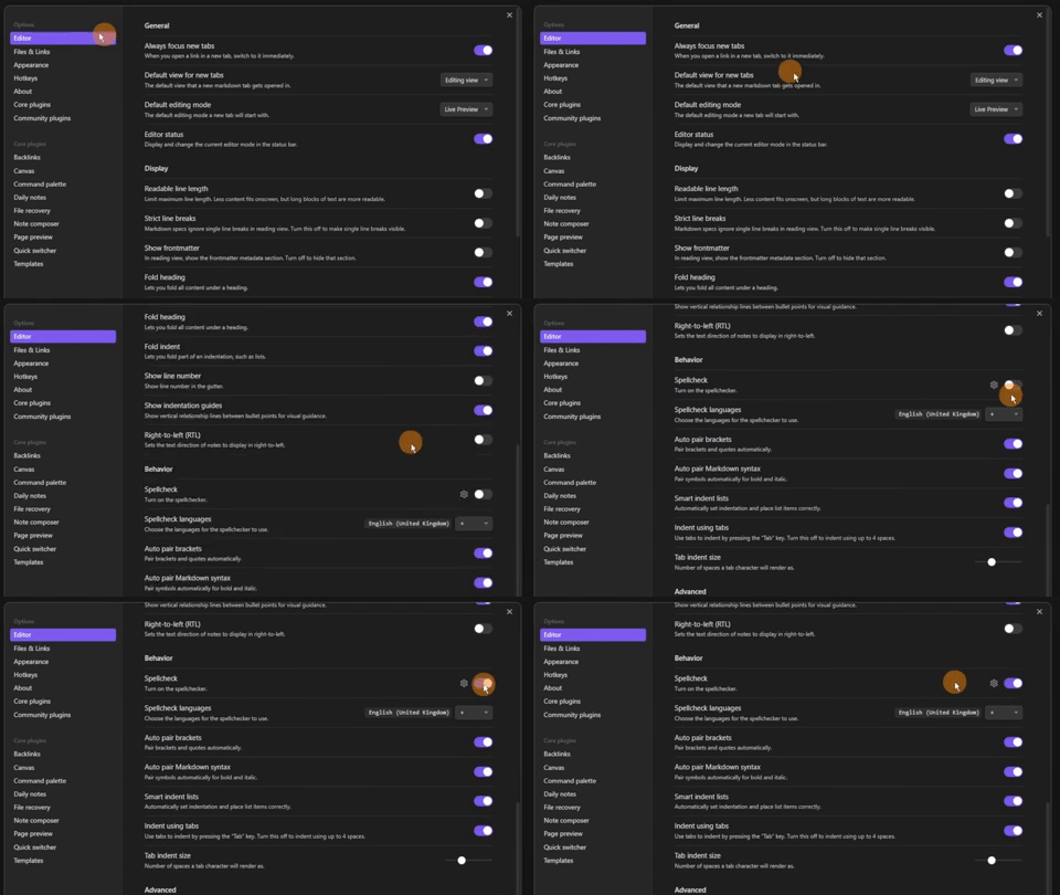
Inside the editor settings, turning on the spellcheck.
Appearance settings
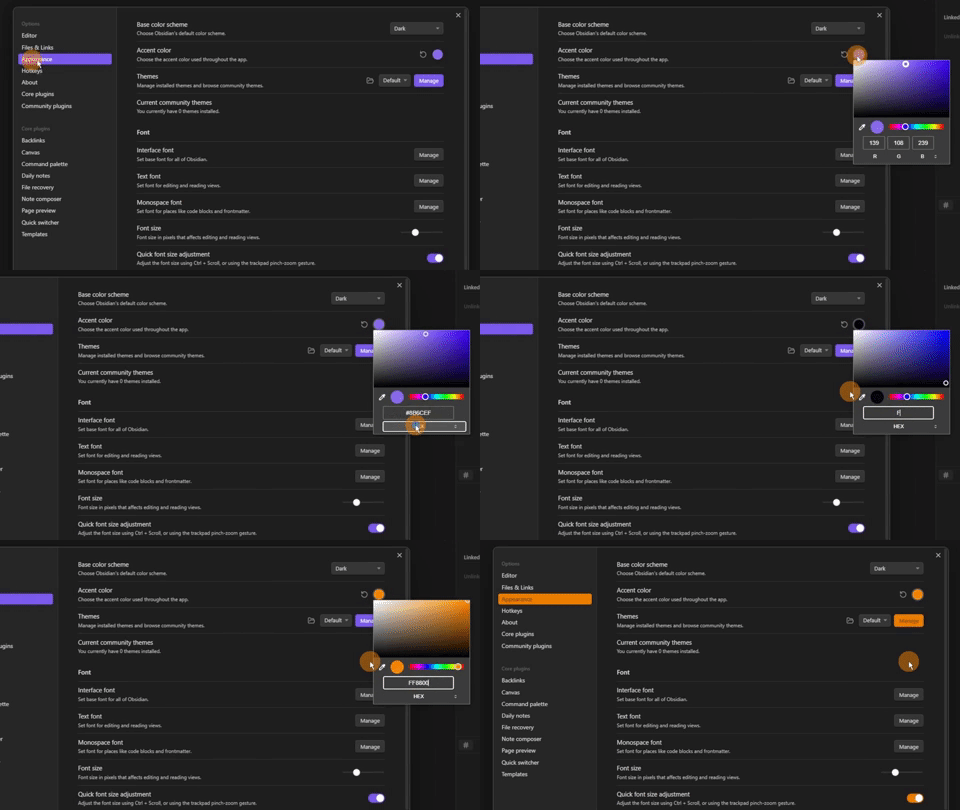
Using the colour picker in the appearance tab to select my preference.
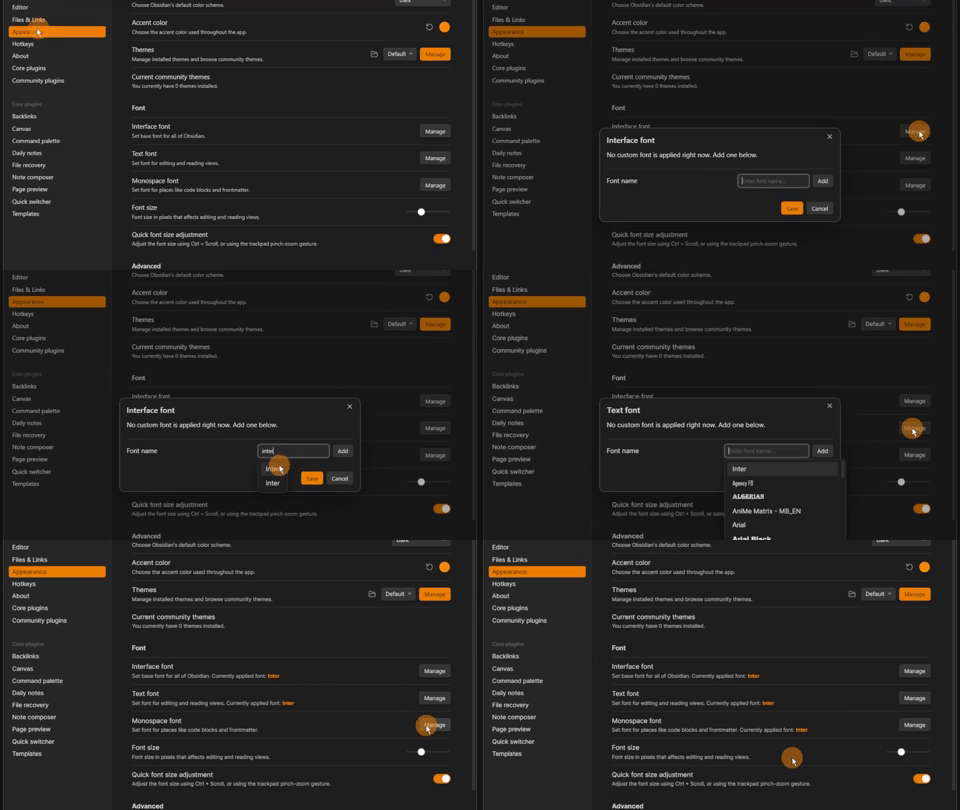
So I can use arrows in my files I use the “inter” font for all my font types.
Plugin settings
Some core plugins can be great for some, but not others.
I use the Obsidian sync for all of my vaults but Publish for just my Vault Craft.
Then I turn off:
- Daily notes
- Graph and local
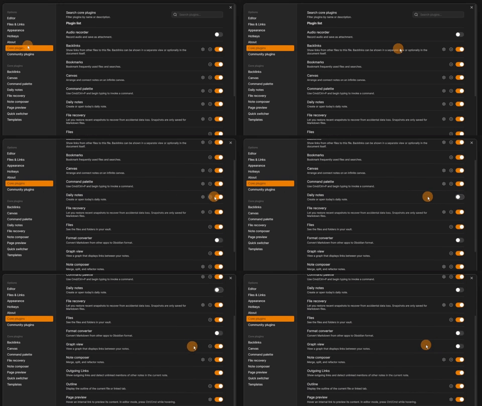
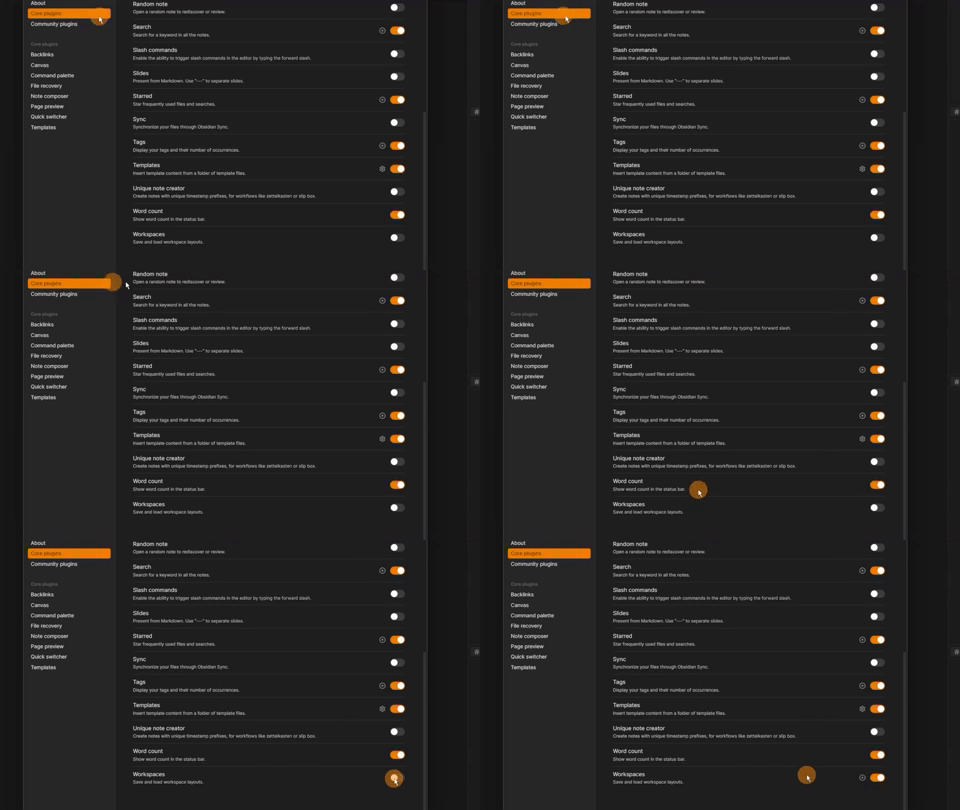
Turn on:
- Workspaces
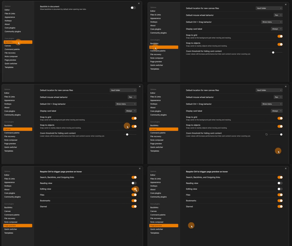
Alter the settings in:
- Backlinks for documents
- Page preview settings change
- Increase canvas threshold
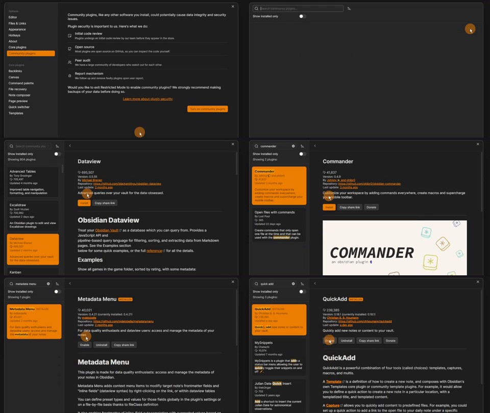
There are hundreds of community plugins to pick from.
I could go without community plugins but given the choice, these would be my go-to plugins:
- Commander
- Dataview
- Metadata
- Quick add
- Workspaces plus
If you use Zotero, the Zotero Integration plugin is almost a MUST-HAVE.
